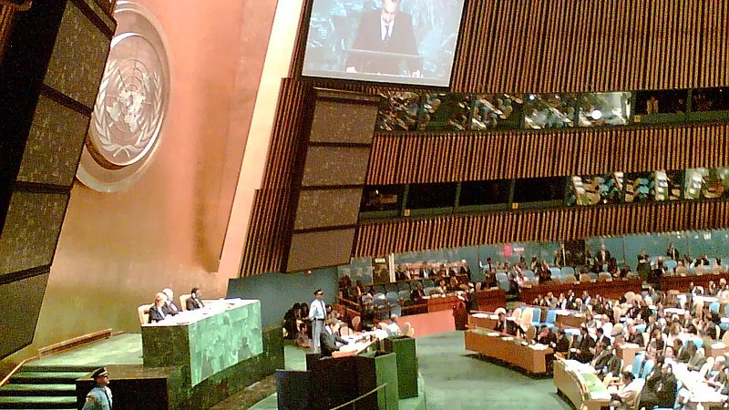
The United Nations has adopted a new world map intended to show Africa’s true size more accurately, drawing renewed attention to a problem that has challenged mapmakers for centuries.
The change focuses on how the world is represented visually, particularly the way Africa appears in comparison with other regions. The move reflects a wider issue in cartography: different world maps can emphasise some features while misrepresenting others.
At the centre of the debate is the difficulty of turning a round planet into a flat image. No single world map can capture every element perfectly, meaning choices made in design can affect how continents, countries and distances appear to viewers.
The adoption of the new map by the UN gives official prominence to concerns about how Africa has been represented in commonly used maps. The aim is to provide a depiction that better reflects the continent’s actual scale.
The development also underlines why maps are not neutral visual tools. They shape how people understand geography, relative size and global relationships, even when they are used for everyday reference.
With the UN now adopting the revised map, attention is likely to remain on the strengths and limitations of different approaches to world mapping, and on how institutions choose the images they use to represent the planet.